HH no. 306
Saturday, February 11, 2017

Friday, February 10, 2017
Sunday, December 6, 2015
PM2.5 from around the world
I made a population-averaged PM2.5 for most countries around the world, based on our databased found here. The green points are SPARTAN sites, which show the concentration of fine aerosols from several months of sampling.
Speciation Legend:

Speciation Legend:

Saturday, November 28, 2015
Gun Violence in the USA: calendar trends
It's nearing the end of 2015, and the US has observed over 330 337 mass shooting incidents, about 1 per day. Although the Paris attacks remind us the United States does not have a monopoly on gun violence, americans still dominate the developed world in long-run statistics. They rank, as a nation, somewhere between levels seen in Mexico and Paraguay.
Unites States gun violence is not homogeneous. Within the US, we know there are certain hot spots mostly along the tiled northwest - southeast axis.
Gun violence is also a subset of all forms of violence. Statistics for total murders in countries are relatively easy to come by, but shooting-specific cases, especially when no-one is killed (but several wounded), have been less rigorously gathered. For instance, that statistic of 330 shootings comes courtesy of the user-compiled shootingtracker.com, which define a "mass shooting" as
A surprising number of perpetrators are labelled "unknown" (about 60% of total), implying the assailant got away. Naturally enough, by knowing the dates of these shootings we also know which day they occurred. Although their data is too recent to show annual trends (which is well-known to be generally decreasing), it turns out day-of-week information can be surprisingly useful on another level.

Let me take on step back. In parallel to browsing shootingtracker, I came across a Washington Post article that highlighted 2015 gun violence by calendar day:
Though visceral, the calendar graph doesn't advance the discussion beyond a reaction of "wow, that's a lot of mass shootings". But it's a start. Going down columns of dates, it appears there are an abundance of "3+ victim" red-colored days on weekends. Meanwhile June seems to have more victims than, say, January. Coincidence? I asked myself how much could seasons and specific weekdays influence murderers? The above calendar gives hints to the non-random qualities of seemingly random gun violence.
Returning then to the Shooting Tracker website, I arranged their January 2013 - Nov 2015 data into Weekday and Monthly statistics. Having the number of wounded is especially useful since wounded outnumber killed by a ratio of 3:1, which can help magnify otherwise hidden trends. And it is quite fair to include injured in the tally given the psychological impacts of being shot. And, by definition, the wounded are the only survivors of a mass shooting event.
Once compiled, it's quick to re-arrange the data. Below are the monthly values, normalized by victims per day (so that February, for instance, can be compared with July):

The jump in victims is strikingly clear during the summer season. From a low of 3 victims per day in the US in January, the killed and injured nearly double in the summer (more so the injured). An uptick in December is also apparent. Why is it that injure account for more of the trend than killed? Perhaps summer months contain more bystanders in public areas. Conversely winter months have fewer people outdoors in colder areas. But I can't see how this explains seasonal violence in warm climate states such as Alabama and Louisiana.
Whether temperature plays a factor or not, with the May-September and December violence in mind, there is a clearly a connection with holiday periods and more victims. That's even more obvious in the day-of-week chart below. Averaging Sunday to Saturday values (number of killed or wounded per week day, divided by 52), we see the weekend is the real killer.

This bar graph clearly shows how weekend shootings are more than double the weekday values. Despite media attention drawn to school shootings, it appears in-class periods have relatively fewer shootings on a monthly and day-of-week basis. Unlike the the monthly values, there is an uptick both in total killed as well as wounded during weekends.
Finally, here are the shooting statistics broken into weekly segments. Though noisy, the overall seasonal trend for the number wounded is apparent:

With all these results in mind, what might be the cause(s)? Are shooters motivated to create violence on days they know more victims are available to be shot? Is it simply pure probability that more bystanders get in the way of bullets (say, in a busy shopping mall)? Are shooters themselves more restless on off-days? (of course, that would presuppose they had a regular Monday-Friday employment schedule).
Or perhaps Shooting Tracker contributors are collecting more of their data on weekends than weekdays (likely they have jobs that extend beyond this free website). Let us crunch a few numbers. In 2013 there were 10.5 shooting deaths per 100,000 Americans. Firearm homicides are one third this value, at 3.5 per 100k. Meanwhile Shooting Tracker logged 503 deaths in 2013, which accounts for only 0.16 of the 3.5 homicides, or about 5%. This is unsurprising, as mass shootings are known to contribute marginally to all gun-related fatalities (thank goodness). Since the percentage is low, there is room for measurement error, so we cannot rule out the possibility that news reports are more thoroughly inspected on weekends. Yet I also find it hard to imagine this could explain a 250% weekend bias, and would not account for any retroactive weekend data collection.
Given the uncertainties, I have no deep thesis to present beyond presenting the questions posed by these two bar charts. Neither can I likely claim to be the first to discover this, (but have yet to find much research on these trends). I hope that the added details of such user-driven statistics will advance our understanding of violence beyond the notion that "Americans Love Guns". They certainly do love guns, but there are additional influences at work. Some week days and some months create more violence than others. As to which months these are, they are clearly non-random. What could weather, holidays, or weekends have to do with mass shootings? I have no idea for certain, but clearly something is going on.
 |
| Comparing firearm-related deaths, including accidental, by country. Original Article. |
Unites States gun violence is not homogeneous. Within the US, we know there are certain hot spots mostly along the tiled northwest - southeast axis.
 |
| From from Business Insider |
Gun violence is also a subset of all forms of violence. Statistics for total murders in countries are relatively easy to come by, but shooting-specific cases, especially when no-one is killed (but several wounded), have been less rigorously gathered. For instance, that statistic of 330 shootings comes courtesy of the user-compiled shootingtracker.com, which define a "mass shooting" as
when four or more people are shot in an event, or related series of events, likely without a cooling off period.Since 2013 contributors have compiled incidents of those injured and killed by guns, linking with confirmed news reports. Here is a geographic distribution of Shooting Tracker data(along with density information) :
A surprising number of perpetrators are labelled "unknown" (about 60% of total), implying the assailant got away. Naturally enough, by knowing the dates of these shootings we also know which day they occurred. Although their data is too recent to show annual trends (which is well-known to be generally decreasing), it turns out day-of-week information can be surprisingly useful on another level.

Let me take on step back. In parallel to browsing shootingtracker, I came across a Washington Post article that highlighted 2015 gun violence by calendar day:
 |
| Gun violence in America for 2015: January to December. |
Returning then to the Shooting Tracker website, I arranged their January 2013 - Nov 2015 data into Weekday and Monthly statistics. Having the number of wounded is especially useful since wounded outnumber killed by a ratio of 3:1, which can help magnify otherwise hidden trends. And it is quite fair to include injured in the tally given the psychological impacts of being shot. And, by definition, the wounded are the only survivors of a mass shooting event.
Once compiled, it's quick to re-arrange the data. Below are the monthly values, normalized by victims per day (so that February, for instance, can be compared with July):

The jump in victims is strikingly clear during the summer season. From a low of 3 victims per day in the US in January, the killed and injured nearly double in the summer (more so the injured). An uptick in December is also apparent. Why is it that injure account for more of the trend than killed? Perhaps summer months contain more bystanders in public areas. Conversely winter months have fewer people outdoors in colder areas. But I can't see how this explains seasonal violence in warm climate states such as Alabama and Louisiana.
Whether temperature plays a factor or not, with the May-September and December violence in mind, there is a clearly a connection with holiday periods and more victims. That's even more obvious in the day-of-week chart below. Averaging Sunday to Saturday values (number of killed or wounded per week day, divided by 52), we see the weekend is the real killer.

This bar graph clearly shows how weekend shootings are more than double the weekday values. Despite media attention drawn to school shootings, it appears in-class periods have relatively fewer shootings on a monthly and day-of-week basis. Unlike the the monthly values, there is an uptick both in total killed as well as wounded during weekends.
Finally, here are the shooting statistics broken into weekly segments. Though noisy, the overall seasonal trend for the number wounded is apparent:

With all these results in mind, what might be the cause(s)? Are shooters motivated to create violence on days they know more victims are available to be shot? Is it simply pure probability that more bystanders get in the way of bullets (say, in a busy shopping mall)? Are shooters themselves more restless on off-days? (of course, that would presuppose they had a regular Monday-Friday employment schedule).
Or perhaps Shooting Tracker contributors are collecting more of their data on weekends than weekdays (likely they have jobs that extend beyond this free website). Let us crunch a few numbers. In 2013 there were 10.5 shooting deaths per 100,000 Americans. Firearm homicides are one third this value, at 3.5 per 100k. Meanwhile Shooting Tracker logged 503 deaths in 2013, which accounts for only 0.16 of the 3.5 homicides, or about 5%. This is unsurprising, as mass shootings are known to contribute marginally to all gun-related fatalities (thank goodness). Since the percentage is low, there is room for measurement error, so we cannot rule out the possibility that news reports are more thoroughly inspected on weekends. Yet I also find it hard to imagine this could explain a 250% weekend bias, and would not account for any retroactive weekend data collection.
Given the uncertainties, I have no deep thesis to present beyond presenting the questions posed by these two bar charts. Neither can I likely claim to be the first to discover this, (but have yet to find much research on these trends). I hope that the added details of such user-driven statistics will advance our understanding of violence beyond the notion that "Americans Love Guns". They certainly do love guns, but there are additional influences at work. Some week days and some months create more violence than others. As to which months these are, they are clearly non-random. What could weather, holidays, or weekends have to do with mass shootings? I have no idea for certain, but clearly something is going on.
Wednesday, November 4, 2015
Thursday, February 5, 2015
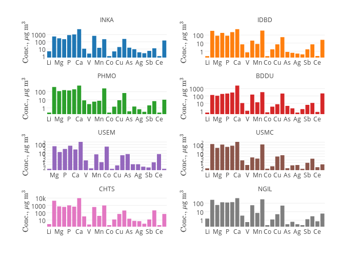
Trace metal plot test
Just a test for trace metals
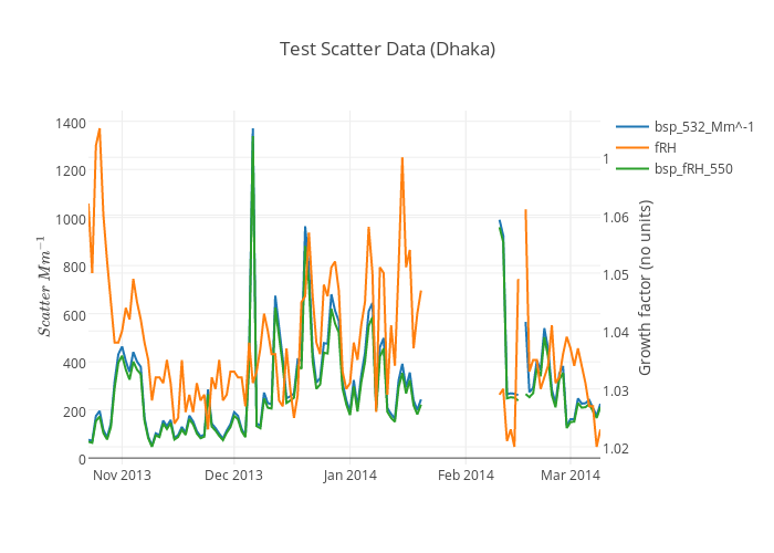
 Another test, this time .csv data imported directly from plot.ly
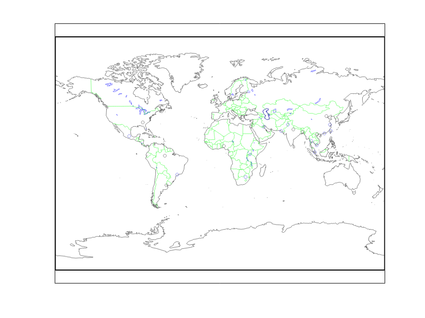
 Finally a world map of SPARTAN sites (code needs a little tweaking)
Wednesday, October 2, 2013
Some shared data
Ok, so here's a first attempt at sharing "raw" SPARTAN data. These are flow tests from January in Beijing. Filters got clogged, followed by a brief period of sadness, and then renewed innovation!
And here's the graph
Thursday, August 30, 2012
SPARTAN update
At the moment it seems that the SPARTAN instrument will be designed as a stacked filter unit. I found the following image on an Australian Government website with a very similar design scheme. This is good news, as I wasn't sure if our instrument had any precedent (i.e. for using two stacked filters preceded by a impaction plate) Another group has been in charge of the the design stage hence why I did not know more about this general approach.
Regarding the coarse and fine filters (separating the "PM2.5" and PM10-PM2.5 mass fractions), we ordered some filters from SPI to do the job: a 47 mm diameter grease-coated membrane filter (part# E4708G-MB with 8um holes, $550 per 100-pack) and a 25mm polycarbonate membrane filter (part # E0425-MB with 0.4 um holes, $70 per 100 pack).
These filters are Nuclepore in spirit but without the eponymous brand name. They are both made of polycarbonate with etched holes to trap coarse and fine particulates, respectively. Notice how much more the 47 mm filters cost. This is due to the grease coating used to prevent bounce-back. I don't know how bad the bounce back is in a straight-shot filter yet it has been argued enough to necessitate the extra cost of the greased filters. I don't know if grease would benefit the smaller size fraction as well. Also the coated disks come in 47 mm diameters only, so we needed to cut them down to size. There were many email discussions about cutting filters in a replicable way, i.e. we need to pre weigh filters accurate to 1 microgram so piece can't be later falling off. The plan is proceed using a sharp steel punch (made courtesy of the workshop in the Dunn basement) sandwiched between two filter papers.
Otherwise the filters look good; the 25 mm filters allows an air flow rate up to 62.5 litres per minute and stable until about 140 degrees Celsius and the coarse filter is much the same. As we are operating these at 4.0 lpm and a temperature between 5-40 degrees, there should be no issue with these parameters.
 |
| Stacked filter unit with a very similar design to our own (except that we will have eight columns instead of just one). |
These filters are Nuclepore in spirit but without the eponymous brand name. They are both made of polycarbonate with etched holes to trap coarse and fine particulates, respectively. Notice how much more the 47 mm filters cost. This is due to the grease coating used to prevent bounce-back. I don't know how bad the bounce back is in a straight-shot filter yet it has been argued enough to necessitate the extra cost of the greased filters. I don't know if grease would benefit the smaller size fraction as well. Also the coated disks come in 47 mm diameters only, so we needed to cut them down to size. There were many email discussions about cutting filters in a replicable way, i.e. we need to pre weigh filters accurate to 1 microgram so piece can't be later falling off. The plan is proceed using a sharp steel punch (made courtesy of the workshop in the Dunn basement) sandwiched between two filter papers.
Otherwise the filters look good; the 25 mm filters allows an air flow rate up to 62.5 litres per minute and stable until about 140 degrees Celsius and the coarse filter is much the same. As we are operating these at 4.0 lpm and a temperature between 5-40 degrees, there should be no issue with these parameters.
Wednesday, August 29, 2012
Measuring PM2.5 around the world
If you want an amazingly well-funded study, you'd be hard pressed to outdo sponsorship from the US department of defence (DOD). In that spirit I present the DODs Enhanced Particulate Matter Surveillance Program (EPMSP), which in their words collected
The DOD sampled each site for 24 hours at 6-day intervals from 2006 to 2007. Each site was measured for PM10, PM2.5, and total suspended particulates (TSP).
 Their sampling equipment came from Airmetrics, which certainly give great credit to the company's instrument reliability (SPARTAN's sampling instruments are still in the early stages of design, but we should (or ought to) have something comparable in the near future. The hard deadline to start field testing is March 2013. My focus is to avoid having things come down to the wire).
EPMSP collected samples on Teflon, Quartz, and Nuclepore filters (I keep wanting to spell it Nucleopore!) in the three size frames. The most impressive statistic is the following account of their total assembled data:
The data itself is very useful for our network, such as the PM2.5 levels we might expect to encounter. In Baghdad and Tikrit, Iraq annual levels exceed 100 ug/m3; Recall that acceptably 'clean' air must have fewer than 10 ug/m3 PM2.5 particulates. The TSP in all 15 sites exceeded 100 ug/m3, while up to 600 ug/m3 in Tikrit. Considering trace metal levels, "The USACHPPM 1-year interim Air-MEG of 3.42 μg/m3 for aluminum (Al) was on average exceeded at all 15 sites". These are not a healthy places to breathe.
The study points out that PM2.5/PM10 ratios vary considerably from place to place. In the middle east they apparently lie between 0.21 and 0.60. More anthropogenic combustion usually means the ratio is higher. This large variance supports the need for separate PM2.5 monitoring; PM10 is clearly only weakly related with fine aerosols.
In terms of sand-based composition, the middle east contains similar amounts of aluminosilicates as compared to the United States' more arid desert regions.


The EPMSP study used Nuclepore filters specifically for SEM analysis, as this surface type is good for very size-selective trapping of particulates on a smooth surface. Background signals are small, and the particulates look 'cleaned', like rock species isolated in a museum case. Their methodology has convinced me we should probably be using only Teflon for chemical analysis and gravimmetric weighing.
Aside: I really admire the openness of the data presented here. As a typical example, they write: "Gravimetric results from both Teflon® and quartz fiber filters were processed and are available on the DOEHRS Portal". Compare this to Canada's NAPS raw data access. Military-funded science is surprisingly more open than some other types. Food for thought.
Aerosol and bulk soil samples ... during a period of approximately one year at 15 military sites—including Djibouti, Afghanistan (Bagram, Khowst), Qatar, United Arab Emirates, Iraq (Balad, Baghdad, Tallil, Tikrit, Taji, Al Asad), and Kuwait (Northern, Central, Coastal, and Southern regions).That's what SPARTAN equals in terms of proposed site counts: up to 20 depending on future funding.
The DOD sampled each site for 24 hours at 6-day intervals from 2006 to 2007. Each site was measured for PM10, PM2.5, and total suspended particulates (TSP).

EPMSP collected samples on Teflon, Quartz, and Nuclepore filters (I keep wanting to spell it Nucleopore!) in the three size frames. The most impressive statistic is the following account of their total assembled data:
The number of laboratory analyses performed in the course of the EPMSP is summarized in Table 2-2, and includes 66,462 analyses on Teflon® membrane, 23,807 on quartz fiber, and several million single particle analyses on Nuclepore®Several million samples! I cannot imagine how long that would take SPARTAN to measure, but not certainly not within my stay at Dal. To be fair most of these were samplings of the Nuclepore filters for scanning electron microscopy (SEM) analysis. The Teflon and quartz filters consisted of 'only' a few tenns of thousands of chemical analyses.
The data itself is very useful for our network, such as the PM2.5 levels we might expect to encounter. In Baghdad and Tikrit, Iraq annual levels exceed 100 ug/m3; Recall that acceptably 'clean' air must have fewer than 10 ug/m3 PM2.5 particulates. The TSP in all 15 sites exceeded 100 ug/m3, while up to 600 ug/m3 in Tikrit. Considering trace metal levels, "The USACHPPM 1-year interim Air-MEG of 3.42 μg/m3 for aluminum (Al) was on average exceeded at all 15 sites". These are not a healthy places to breathe.
The study points out that PM2.5/PM10 ratios vary considerably from place to place. In the middle east they apparently lie between 0.21 and 0.60. More anthropogenic combustion usually means the ratio is higher. This large variance supports the need for separate PM2.5 monitoring; PM10 is clearly only weakly related with fine aerosols.
In terms of sand-based composition, the middle east contains similar amounts of aluminosilicates as compared to the United States' more arid desert regions.


The EPMSP study used Nuclepore filters specifically for SEM analysis, as this surface type is good for very size-selective trapping of particulates on a smooth surface. Background signals are small, and the particulates look 'cleaned', like rock species isolated in a museum case. Their methodology has convinced me we should probably be using only Teflon for chemical analysis and gravimmetric weighing.
---
Aside: I really admire the openness of the data presented here. As a typical example, they write: "Gravimetric results from both Teflon® and quartz fiber filters were processed and are available on the DOEHRS Portal". Compare this to Canada's NAPS raw data access. Military-funded science is surprisingly more open than some other types. Food for thought.
Friday, August 24, 2012
Sampling flow chart
Here's the sampling procedure for our SPARTAN filter network:


Filters will be placed inside a regulated flow apparatus. The prototype design calls for 4 Lpm over a 25 mm diameter filter. The filter is going to be teflon or nucleopore. The former is good because it's easy to clean, the latter is good because volatile nitrates escape less easily. There is no obvious choice, but likely we will end up with teflon.
The steps in the above chart aren't individually complex, but extreme care is needed in order to ensure quality data. If anything goes wrong at any stage (weighing, ion dissolution in water, etc), you can bet the whole goal of the network might be compromised.
Last month I was focused on comparing total PM2.5 aerosol mass with nephelometer bscat measurements. It was important to know as much about what affects the light scattering of aerosols as possible, since the ultimate goal of the network is quantitative PM2.5 mass data (measured in micrograms per cubic meter). One should back spectroscopy data if at all possible (astrophysicists are, for example, limited to spectral data). Even ground nephelometer measurements must be supported by actual weighed filters. Somehow this gives me satisfaction known that practical chemistry has a place among all this modern satellite equipment.
Tuesday, August 7, 2012
Splitting aerosols
How much more surface area do you obtain from splitting aerosols in half? That is to say a constant volume holds while splitting the aerosol volume like so:
 I want to compare surface S1 with surface S2. Since surface is related to volume like so,
 then the ration S2/S1 becomes (and accounting for the two spheres in S2),


Hence there is 26% more surface area available if all sphere of volume V divide into spheres of volume V/2.
If the aerosol is split unevenly into fractions x and 1- x (where 0 < x < 1), then
 which looks like this:

The equation is if course symmetric about the point x = 0.5.


Hence there is 26% more surface area available if all sphere of volume V divide into spheres of volume V/2.
If the aerosol is split unevenly into fractions x and 1- x (where 0 < x < 1), then


The equation is if course symmetric about the point x = 0.5.
Subscribe to:
Posts (Atom)